What lighting trends inspired this collection?
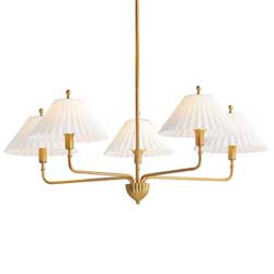
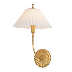
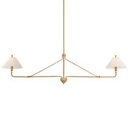
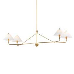
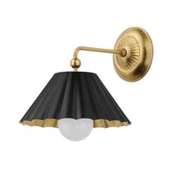
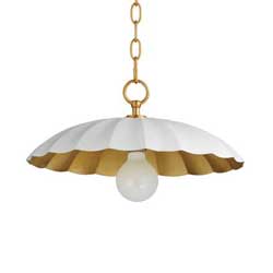
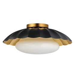
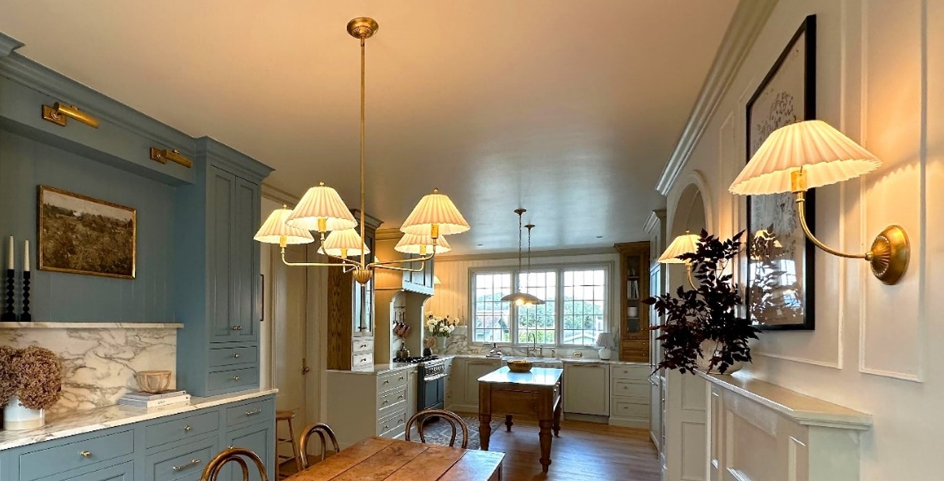
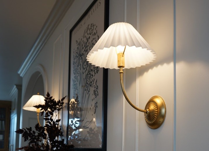
This collection is a throwback to pleated shades, we’re seeing a lot of that. And a lot of wave and ruffle designs are making a comeback. You don’t see a lot of pleated shade, though, in a glass option. And with so many fabric options, that’s wonderful, but in kitchens having something easily wipeable was super important to me, so kitchens and bathrooms were at the forefront of my mind when considering how to do that pleated trend.
What styles of design do you like?
The reason for the milky finish on the glass is because I like to mix old and new. I really like traditional design, but for it to feel elevated, new, and current, so it doesn’t feel like grandma’s house. The nod to the pleated shade is very throwback anyway and can already feel dated if not done right. And the milky glass has a combination of a trend and an antique, so it doesn’t feel too trendy or dated, it’s kind of a marriage.
What role do you feel lighting plays in design?
It’s extremely important. While it’s a finishing touch, it’s something that’s considered right away. Having multiple layers of lighting; ambient, overhead and task, can really change the feeling of a space and make it feel more like home. And with open concept living, that’s very important. It’s an extremely crucial part of the design process.
What inspires you as a designer?
Lots of things inspire me. Other designers, architecture, nature, but I have always been very inspired by classic design. Even as a kid, I was obsessed with the Father of the Bride house, I love a Nancy Meyers film set. All of them feel warm and cozy and welcoming, and that’s how I want spaces I touch to feel. I love sleek, contemporary design as well, I admire all kinds of design styles, but when you come into a space that I’ve designed, even if it’s brand-new, I want it lived in and warm and cozy, that’s really my aesthetic. Our tagline is “we build homes, not houses.”

Do you feel like these collections lend themselves to a variety of homes?
Parts of the line that have scalloped detail and the sconces that are metal with the gold interior, I feel like those are super playful and work in a contemporary home. The chandelier and the sconces with the glass shades feel more elevated and traditional, but they’re still on trend enough to where they don’t feel too stuffy for a home that is trendier. They play nicely in homes that want to have a balance.
How has your use of lighting evolved?
I’ve always known how important it was, but maybe didn’t think of it in the first stages and treated it like something you add at the end. Where now I think of what lighting I’m going to use, how many different areas of the room I want to have lighting, and how I want them to play each other, so it’s evolved to where I think about it sooner in the design.
What was your experience working with Maxim?
Working with Maxim was super exciting. At first, we talked about different things we could work on together, but they were very quickly open to me bringing my own designs to the table and I let them know right away, it’s gonna be rough sketches in pencil and me talking through ideas. I’m not a graphic designer, I don’t have that capability and they were totally open to that and able to see these crude sketches in pencil and listen to my ideas and nail it in production. It was thrilling to work with someone who got what you were trying to get across. I couldn’t be happier with the result.
Working with Maxim was super exciting. At first, we talked about different things we could work on together, but they were very quickly open to me bringing my own designs to the table and I let them know right away, it’s gonna be rough sketches in pencil and me talking through ideas. I’m not a graphic designer, I don’t have that capability and they were totally open to that and able to see these crude sketches in pencil and listen to my ideas and nail it in production. It was thrilling to work with someone who got what you were trying to get across. I couldn’t be happier with the result.

